An 80-Year-Old Gets a Make-Over: Updating a Book Cover
George Washington Carver: An American Biography
“You can’t judge a book by its cover.”
While the adage refers to how you can’t tell by someone’s exterior what’s actually on the interior. . . it doesn’t really fit with actual book covers.
People often judge a book by its cover. It’s the first thing that draws us to the book!
With George Washington Carver: An American Biography, I changed the book’s cover dramatically.
This was the original 1942 cover.
I liked it well enough, a depiction that gave Carver a commanding yet gentle presence, spot-on true to his personality. But overall, it fell flat—drab in color palette and, although I’m no youth-worshipper, Carver as a very old man didn’t appeal to me. It did fit the 1940s era it came from.
My biggest problem was there was no indication of one of Carver’s greatest and lifelong loves—ART!
Well, it’s a new era.
When I finally made the financial commitment to commission original art, I first sought a Black artist. When a couple of choices didn’t work out, I went with someone whose work I loved that was local, Michael Beenenga, a Colorado artist and longtime family friend. (Mike’s stepdaughter Shelby has been friends with our daughter Lily since Kindergarten.) Mike created the Greenwoman logos too! He’s a delight to work with.
The first art I saw of Mike’s was a mural he painted around the time our daughters met. It’s on the Crystal Wizard store in Manitou Springs, Colorado. The mural shows fairies, Tommyknocker elves, local trees, and more. You can read about it and see the wonderful details here.
Mike and I talked it over. I said I wanted something that would appeal to a modern audience and would show Carver in a brand new light as “a creator of a better world” and as an artist. I also loved the idea of showing Carver as a younger yet mature man with all the energy that Carver displayed throughout almost all of his life.
Mike sent his first sketch:
I liked it, but I wasn’t sure. My daughter Zora (who did the layout of the book’s interior and helps authors design and edit their books) wasn’t keen on the rococo look, which harkened back to my Greenwoman Magazine covers and my logos. I was the one who suggested that look. Oops. My bad!
“More modern,” Zora said. I agreed.
Mike thought about it and said he envisioned the color red, something that would jump out at book buyers and command their attention.
I loved that idea.
He sent the next draft, writing:
“This is still fairly rough . . . but the goal is for the top and bottom areas to look like a bright red, African-culture wax print fabric that I found online. The areas with heavy black outline could be a block cut linograph style. It could surround the realistic painting and GWC’s portrait. The whole linograph and painted area could have a sepia or slight tan/black and white vintage feel.
“Part of his figure could also look like it is a block cut print…. Then morphing into a realistic portrait of him, his arms and hands….we can add other symbols of his story… or other ‘byproducts’ of his discoveries…. Coming from the palette could be a multicolored spectrum of ‘paint’ to represent the endless inspiration around him in nature…. The font could look like crafted/cut paper. (I have a sample attached.) Let me know your thoughts.…”
Thanks,
MB
I responded with a few comments. “I love it.” being the first. I wanted Carver younger though, and countered Mike’s inspirational photo with my own.
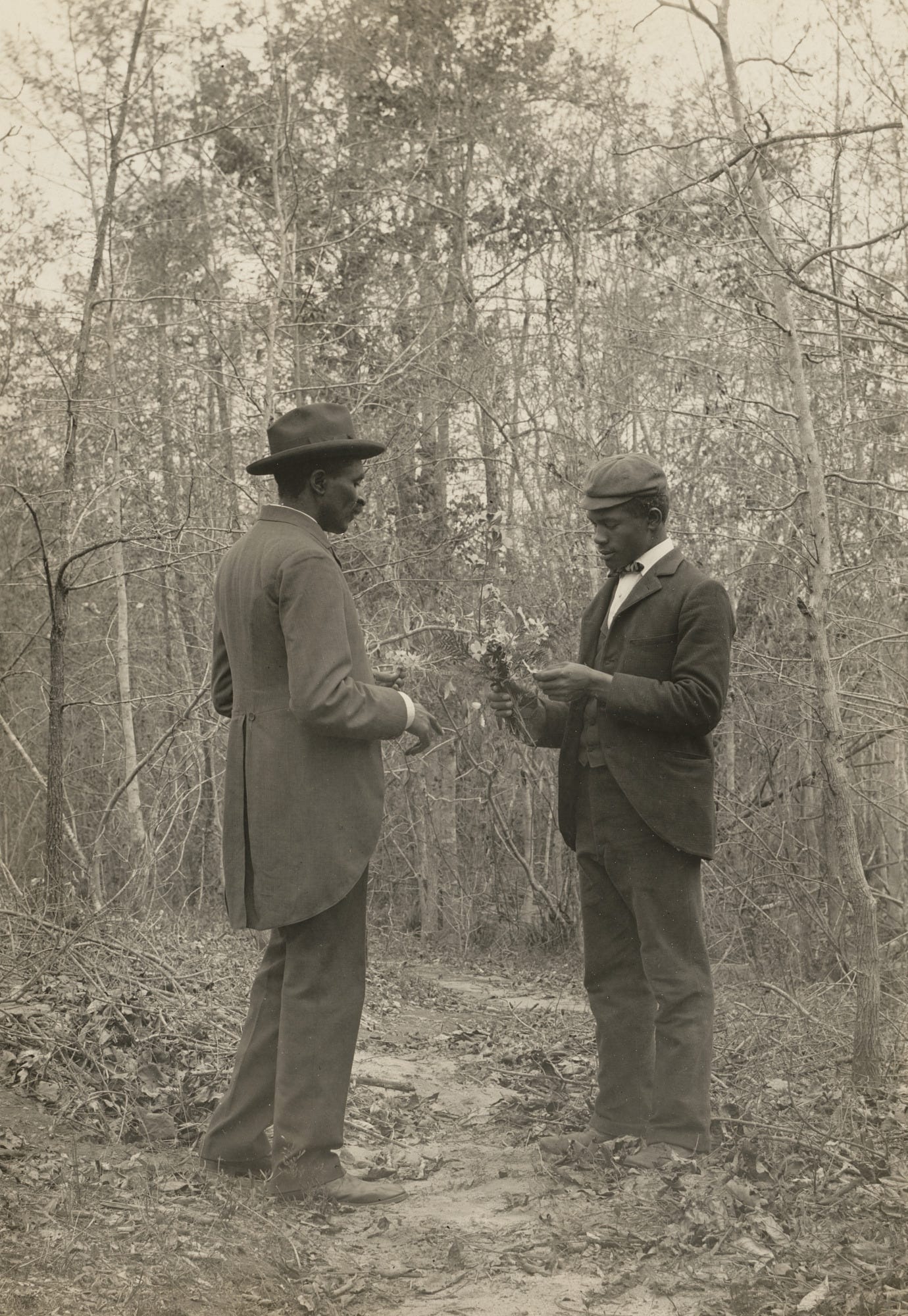
I sent him an image I found of Carver and a student at Tuskegee studying botany in 1900. An image that I love.

I also noted that Rackham Holt’s name would have to be on the cover and I listed a few images I hoped he could include that could be hidden symbols (or maybe “Easter eggs” as a writer recently suggested).
The images I asked for included:
a cross to symbolize Carver’s Christianity
a flower in his lapel (his signature style)
the amaryllis flower that he loved and bred
peanuts (of course!)
the diamond that Tom Huston of Tom’s Peanuts gave him (those who read the book will discover it’s one of the most endearing stories about Carver’s complete lack of materialism)
and the color “Egyptian blue” that he made from Alabama clay
The final reveal: a painting that would soon be a book cover!
I thought it was exciting and I think it’ll appeal to younger readers. I love that it gives a totally different feel of Carver and brings his story into the 21st century! (Thanks, Mike!)
(You can purchase this classic biography on Amazon or on the Barnes & Noble website! Feel free to contact me at greenwoman@substack.com if you’re interested in bulk orders or distribution!)


I love all the Easter eggs in the cover and this beautiful artwork!
I have 2 copies at Christmas and both recipients LOVED the book!!!!